Smile avatar · Dark
01kicknroll-avatar-smile-dark.svg
2.4 KB
Artwork, colour, type and the small moments that make us feel like us. A shared reference for our team, retail partners and anyone telling our story.
Original logos, symbols and expressive elements.
Choose an asset to take a closer look.
kicknroll-avatar-smile-dark.svg
kicknroll-avatar-wordmark-mint.svg
kicknroll-avatar-wordmark-dark.svg
kicknroll-avatar-wordmark-mint-square.png
kicknroll-highlight-double-green.svg
kicknroll-highlight-single-amber.svg
kicknroll-sticker-star-purple.svg
kicknroll-symbol-smile-white.svg
kicknroll-path-wave-single.svg
kicknroll-path-bend-compact.svg
kicknroll-path-zigzag-01.svg
kicknroll-path-bend-wide.svg
kicknroll-path-zigzag-02.svg
kicknroll-path-underline-double.svg
lamborghini-shield-gold-rgb.png
kicknroll-social-avatar-sheet.pdf
kicknroll-path-layout-reference.png
Try an original filename, an English asset name or a hex colour from an SVG.
Values from the brand guide and source files.
Differences are preserved for review.
For body copy and everyday headings. The same local font powers the library and the storefront.
Regular weight. Clear hierarchy through scale, line height and space.ABC Stefan Simple · For short words and expressive phrases only
Body copy stays readable on a phone, too. Text uses relative units so browser text preferences can scale it.
1rem / 16px0.9375rem / 15px0.875rem / 14px0.75rem / 12pxPixel equivalents use a 16px browser default. Main actions use 16px; captions never replace body copy or instructions.
Keep the logo and symbols in their original proportions. Give them room to breathe. The 17 originals here retain their original formats and artwork; the website examples show how they are applied.
Grey usually stands in for a supporting colour. Choose it to suit the product and layout. Never stretch the artwork or use reference screenshots as decorative assets.
Use a clear wordmark where the name needs to be read, and the smile for small moments of recognition. Preview artwork against light and dark backgrounds before choosing. The website’s mint smile is the browser icon.
Use Poppins for useful information and ABC Stefan Simple for short expressive phrases. Keep body text at the shared web scale, with space between lines. Light and dark modes use the same hierarchy.
Keep shop imagery clear of repeated age stickers. Use filters and product details for rider age. Pagination uses simple numbers and arrows, with a subtle current-page mark. Save expressive compositions for moments that benefit from them.
Images arrive before their details. Colour choices unfold, then names appear. Let the support smile take its time. Repeated controls stay quiet, and reduced-motion preferences keep the same content available.
The website’s current applications.
Shown separately from the original artwork.
The wordmark leads our navigation. Its colour follows the page, with space around every letter.
 Kick’n’roll
The mint smile keeps its character at a small size. It is our current browser and saved-site icon.
A clear account entrance. A small dot when the bag has something inside. Everyday controls stay understated.
Static content · Interactions ready
01 / Arrive Build the story, element by element.
02 / Respond Make every action feel connected.
03 / Settle A little energy. A clear resting state.
Current website components, using the same artwork, styles and motion. Try the bag and the smile, then explore each page in context.
The original purple star highlights a published rider age on a product detail page. Shop cards keep the focus on the product, with age available through filters and details.
Click the smile. It takes a little trip beyond the page’s right edge, pauses, then gently rolls in from the left with one new companion following along. Up to three. Reduced motion adds them without rolling.
Visit supportThe header keeps an empty bag quiet. A small mint dot signals items inside; quantities appear in the bag. The account icon leads to login or your account.
Age, colour and scooter type. Clear stock states and aligned actions.
Published ages, handlebar heights and rider limits, in readable rows.
Clear product details, quantity controls and a rounded order summary.
Readable form fields, payment options and nearby feedback.
Login, orders and empty states with a useful next step.
Verified guest lookup, shared parcel cards and direct carrier links. The same delivery details appear in account orders.
Original paths and short lettering composed as one piece.
Clear answers, all the way.
Collection invitation → filters → image-ready cards → product details → colours and names. The introduction leads into the same product sequence.
Each section enters once, when visible. Filtering updates products without repeating the introduction. Click or focus to reveal controls immediately. Reduced motion keeps everything still and available.
La colección
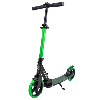
Lamborghini
Detalles atrevidos. Personalidades brillantes. Encuentra la forma, el color y el ajuste para su próxima pequeña aventura.
Descubre los 2 modelos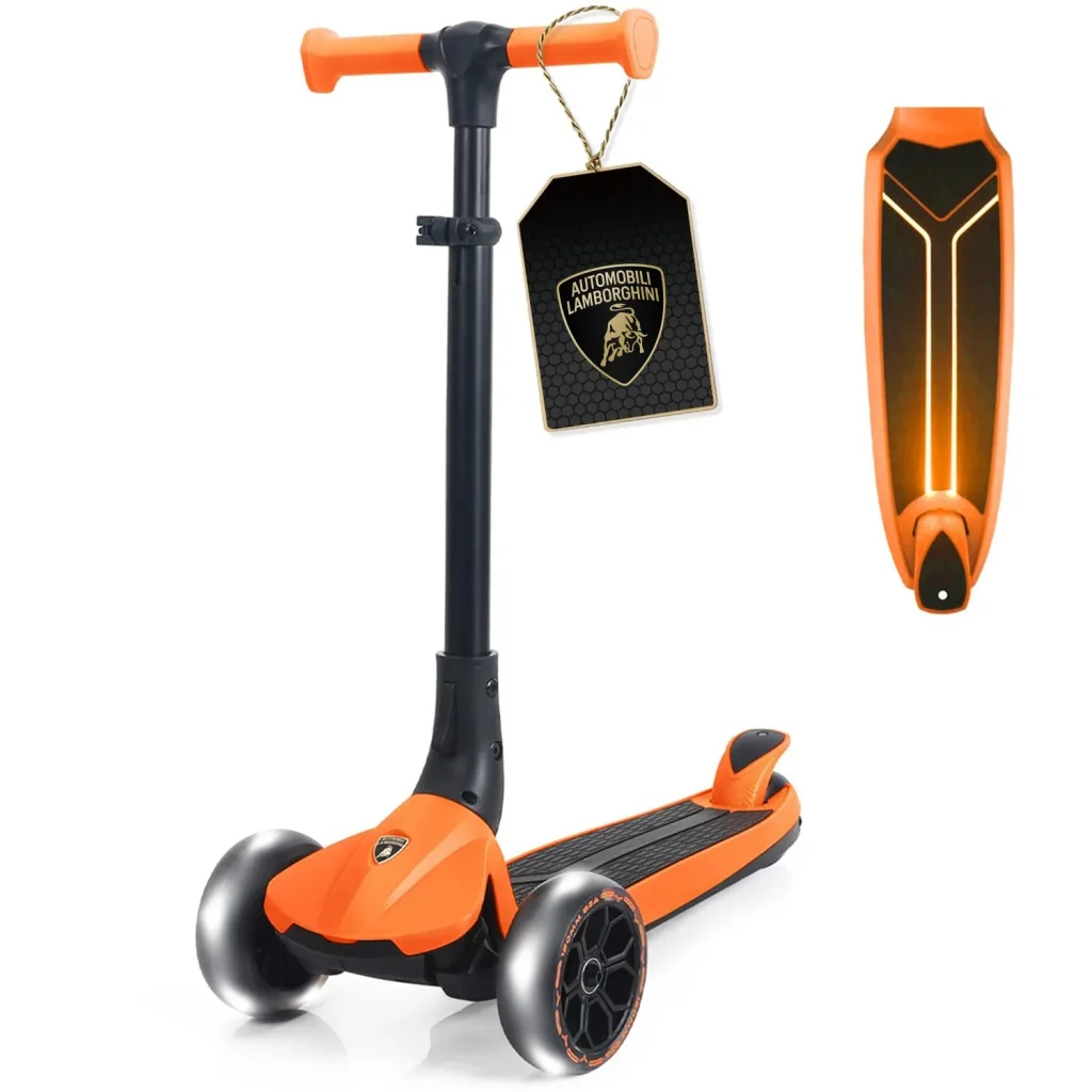
Una colección. Distintos estilos.
Conoce la colección
Empieza por su estilo y comprueba después la edad, la altura y el peso máximo de cada modelo.
The main image arrives first. The name, price and description follow, then one colour opens into the full palette. Names and controls complete the view.
On mobile, the purchase section starts when it comes into view. Click or focus to finish immediately. Slow images, direct section links and reduced motion keep content available.
Introduction → one option per step → choices unfold → model images and specifications. The age options open after the Ride type heading arrives. Scroll through the guide to see each section enter.
Un poco de ayuda para elegir
Empieza por su edad y por cómo quiere usarlo. Después compara los detalles que marcan la diferencia.
Busquemos su modeloEmpieza aquí
Elige una edad y un tipo para acotar la búsqueda.
No se pudieron actualizar los resultados. Cargar los modelos seleccionados
Un buen punto de partida
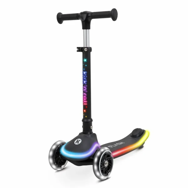
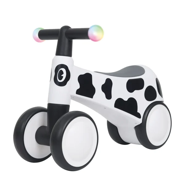
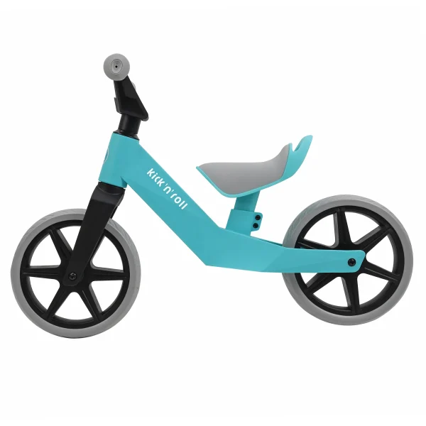
3 models to compare
Edad3Y-12Y
Edad12M-60M
Edad18M-5Y
Antes del primer impulso
Compara la altura del manubrio con un scooter que le quede bien. En una bicicleta de equilibrio o un montable, los dos pies deben llegar al suelo.
Comprueba los límites de edad y peso de cada modo. Puede que un niño pequeño solo encaje en el modo sentado.
Consulta la página del producto para ver especificaciones, colores e instrucciones. ¿Falta alguna medida? Pregúntanos.
The same guide and animation run on the site. These choices open the real finder without changing your bag. Reduced motion, interrupted animations and slow images keep the information available.
The same product menu and live search as the website, with transparent product cutouts, age guidance and a quieter collection invitation.
Su próxima aventura.
Ver todoThese links lead to the current website. Search reads the published product collection.
Order details, delivery links and email share the same calm hierarchy. Clear information comes first.
Sigue cada paquete en la web del transportista para ver las últimas novedades.
Package 1 of 1
A tracking link isn’t available yet. We’re here to help.
An illustrative parcel, with no customer details. Verified orders show the saved tracking number and a link to the carrier’s website when available.
Visit Track my orderThe current order-email design, filled with example content. This preview does not send an email.
Visit My accountEvery adventure starts somewhere.
A clear headline. A little context. Then a way forward. Our interface arrives in the same order you read it.
Explore the collectionTry a mouse, a tap, or the Tab key. None of these examples submits data.
Open, close, press Esc. Focus returns to the card.
Real files from this library. Sort, filter or search: only the rows that change need to move.
| Format | ||
|---|---|---|
| Smile avatar · Dark | SVG | 2.4 KB |
| Wordmark avatar · Dark | SVG | 4.1 KB |
| Wordmark avatar · Square | PNG | 23.4 KB |
| Smile symbol · White | SVG | 1.3 KB |
| Bend path · Wide | SVG | 2.2 KB |
| Social avatars · Reference | 58.5 KB |
Try another name or format. Your source files are unchanged.
6 of 6 assets.
The header and column widths stay in place. File values never count up or bounce.
TRY THE CONTENT STATES Local preview · No request is sent
The frame keeps its space as the content changes.
A quiet placeholder; no fabricated progress percentage.
Explain what is missing, then offer a useful next step.
Keep the message beside the action. Never shake the content.
Completion is stated in words, not colour alone.
Every component has a decision. “Still” is intentional, not an omitted state. These are current theme rules, not additions to the original VI artwork.
| Component | Entrance | Interaction / update | Exit | Reduced motion |
|---|---|---|---|---|
| Headings & copy | Reading order, once | Focused content immediately visible | No scroll-out effect | Visible immediately |
| Panels & surfaces | Stable frame; children assemble | One sequence, no nested translations | Owned by tabs / dialog | Stable layout |
| Lists & details | Whole rows, 45 ms steps | Label + value remain paired | No decorative disappearance | All rows readable |
| Data tables | Header stays; up to 8 rows enter | Opt-in sort / filter, 280 ms reflow | Filtered rows removed immediately | Instant results |
| Media & cards | Media → copy → action | Restrained hover; filtering retains position | Collection / dialog owns transition | No reveal or zoom |
| Product detail | Decoded gallery → title and price → palette → names and controls | Mobile sections enter on arrival; focus or click reveals immediately | Gallery and native variations remain responsive | All information and controls visible |
| Shop cards | Decoded image → copy → one swatch → palette → names | 110 ms card stagger; focus or click settles immediately | Offscreen and interrupted cards stay readable | All options available immediately |
| Shop & collection introduction | Invitation → grouped filters; collection copy → image → category cards | Native links and filters remain immediate; AJAX does not replay the introduction | Viewport, focus and resize settle the sequence | All content visible; no motion chunk needed |
| Ride finder | Introduction → first option in each step → choices unfold → decoded model images → paired specifications | Native matching, history and focus; only updated results enter after filtering | Offscreen, interrupted and slow content stays readable | Immediate guide and results; no motion chunk needed |
| Buttons & links | End of reading group | Hover, press, focus, busy, disabled | Release settles | Static, clear states |
| Tabs & navigation | First view uses its content recipe | Indicator + short directional return | Old view hidden immediately | Instant switching |
| Dialogs | Origin → window → contents | Esc, focus containment, rapid close | 180 ms; focus returns | Instant open / close |
| Disclosure | Measured space opens | Content stays in document order | Faster collapse | Native open / close |
| Content states | Reserved space | Loading / empty / error / success; text first | Old state replaced immediately | Same messages, no travel |
| Commerce data | Purchase updates remain immediate | Native prices, stock and validation | No delayed transaction controls | Same native behaviour |
| Floating shopping bag | Rounded card and content arrive in sequence | Large product image, rounded subtotal, stable page width | 220 ms; focus returns | Instant open / close |
| Support smile | Original symbol, clear of the copy | Roll off the right edge, pause, then return slowly from the heading’s side; one new companion follows each time, up to three | Gentle start and stop; whole family settles on interruption, no queued clicks | Companions appear without travel |
| Colour & brand play | Light by default / explicit play | One-click light/dark switch and animated SVG; optional physics study | Pause offscreen; no automatic loop | Immediate colour; static artwork |
No-JavaScript HTML is readable. If GSAP fails, sorting, filters, tabs, dialogs and state controls still work. Long tables never wait for every row to animate; commerce tables are not opted into the demo sorter.
Canvas, surfaces, text, controls and feedback change together. Artwork keeps its original colours.
Light palette · Switch manually
Canvas
Surface
Mint surface
Text
Primary action
These are working theme components, not isolated videos. The same behaviour powers this library and the theme’s supported UI. Reduced motion keeps every function available.
For source files, retail materials or help choosing the right artwork, tell us what you have in mind.